SAP acquired a company called Fedem in 2016 (a Norwegian company ) which does work in the field of Newtonian physics for real world structures. This sounds complicated but essentially it maps real world stress into 3d digital models in a heatmap.
Please note that details / user research/ pictures are not shown online in these case studies and only older shipped work available publicly is displayed because of the sensitive nature of Enterprise Software and as I still continue to work here . Details can be discussed in person.
THE STORY :
Imagine a service engineer who is in charge of the health of the windmills in a wind farm in the middle of the Greenland sea. He has to periodically manually inspect the windmills . This is a very hazardous job and is a story played across multiple scenarios in the Industrial world. These persons do their job in EXTREMELY HAZARDOUS PHYSICAL CONDITIONS.
People do these inspections on Windmills , bridges , reactors etc. So lets for a moment try and empathize with our persona Svalbard and understand their day in a life below.
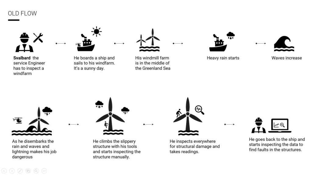
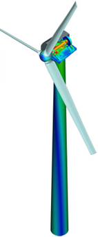
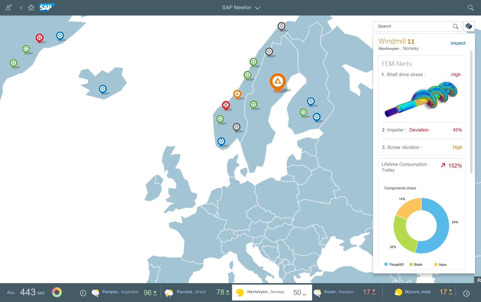
Now that we understand Svalbard’s work environment lets take a step into the future where our user doesn’t have to do this hazardous physical journey and inspection anymore. The SAP technology allows us to have a 3d digital twin. The actual real world windmill is fitted with vibration sensors which can replicate exactly what kind of stresses the entire structure goes thru and map them in a color coded heatmap on the 3d digital twin .
MY ROLE
Led the design along with 2 more designers and created the cloud version of the application and came up with the design vision of the suite.
This slowly evolved over the last four years into simulations and other design and analytical tools and is now a module in the PLM product suite and I am responsible for the UX of the entire PLM product suite consisting of multiple applications .
See the “jazzy” AR demo below for a quick intro. The expert UI’s are not like this 🙂
THE CHALLENGE :
HOW MIGHT WE ENABLE THE SERVICE ENGINEER TO DEEP DIVE AND DO BIG DATA ANALYSIS OF REMOTE STRUCTURES TO PREDICT FAILURES WHILE AT THE SAME TIME GIVING HIM THE BIG PICTURE OF THE HEALTH OF THE FLEET.
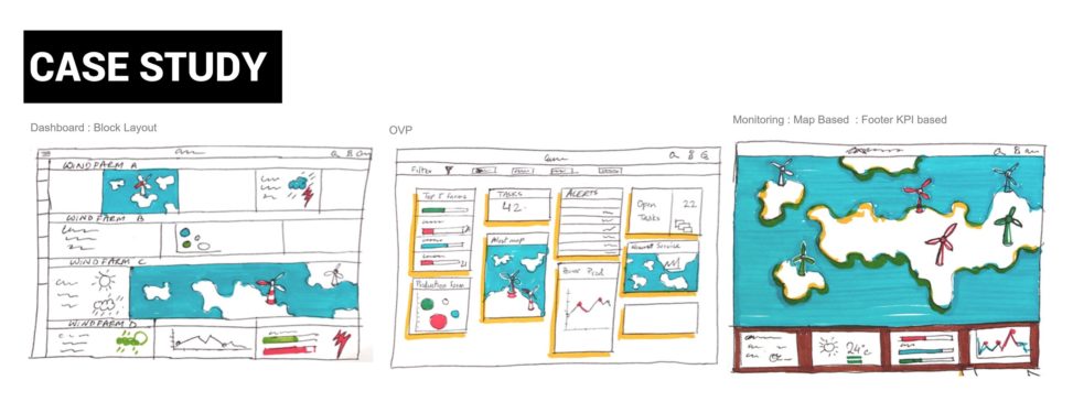
Extensive research and discussions with co-innovation customers and product owners and data scientists threw up challenges which was difficult to integrate in a single UI. So I envisioned 6 micro apps which were all integrated to each other. A user like this doesnt need to dive into each and every windmill to analyse the structures everyday. The solution was a dashboard layout which would have notifications coming up and visualized in cards with highlights. Individual cards would have multiple data within an alerting framework.
High level alerts would drill down into either fleets or into individual windmills with analytics and 3d visualizations and big data charts.
ANALYTICS : Charts are all well and good but here is where the complexity of enterprise software with multiple customers and their differing requirements and business processes throw a spanner in custom UI’s like these. Who would be creating these analytical frameworks and maintaining them. Luckily with my knowledge of having worked in previous analytical projects I proposed to integrate an existing SAP analytic tool called Smart Business (which I had co-designed ) which would do the heavy lifting of data modelling , analytics etc. We would just need to embed the analytic pieces in our UI’s. WHY REINVENT THE WHEEEL ?
INFORMATION ARCHITECTURE & PRODUCT VISION
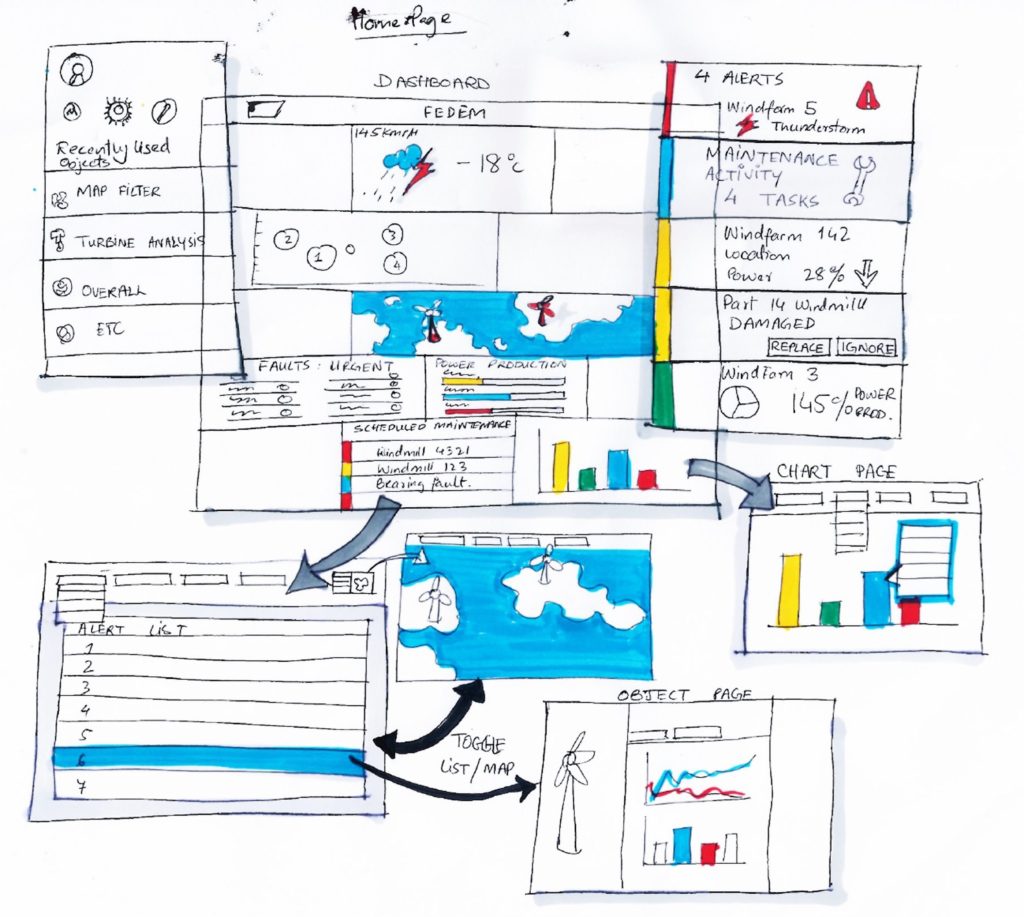
The big picture idea gave us a lot of understanding of where the broken pieces were and how to stitch together a comprehensive user story. Here is an example of the initial IA and screen flow. This of course changed in the last 3 years.
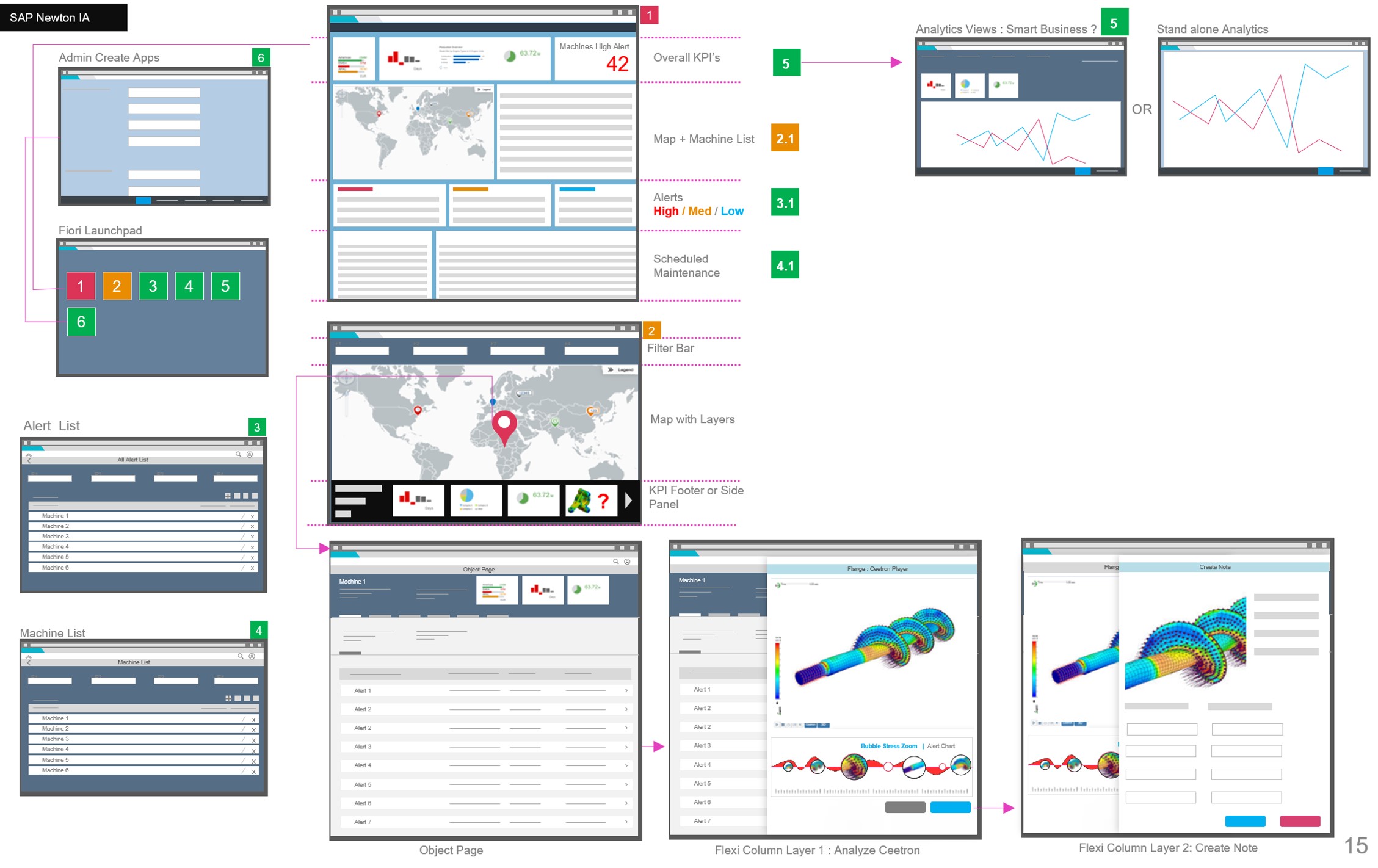
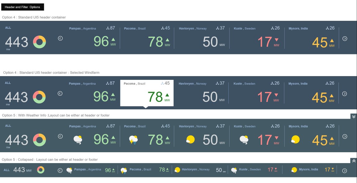
The initial landing page with a Visual footer KPI bar for easy access to multiple windfarms spread across the world. Each equipment is visualized in a semantic marker.
Interaction modes for the visual KPI footer bar
Customers were not exactly flocking to the solution. So what was the problem?
The solution was very futuristic and forward looking but adoption was low. We realized after two years that end users were not really interested in managing a large fleet of assets. WHY ?
Five to ten million dollars per asset is a norm. In this kind of situation you dont need UI’s at a fleet level. They would be reactionary sometimes (like in an alert activated investigation ) but proactive and working on mostly deep investigative analysis of one structure because of the expensive assets.
REFRAMING THE PROBLEM
Some deep dives with PO’s and customer calls were insufficient to come up with an answer. They nature of what we were doing was so new and far fetched from what the service engineer was used to that they couldnt put it into words. But after a lot of probing we realised the need for a dynamic analysis tool.
CONNECTING THE DOTS
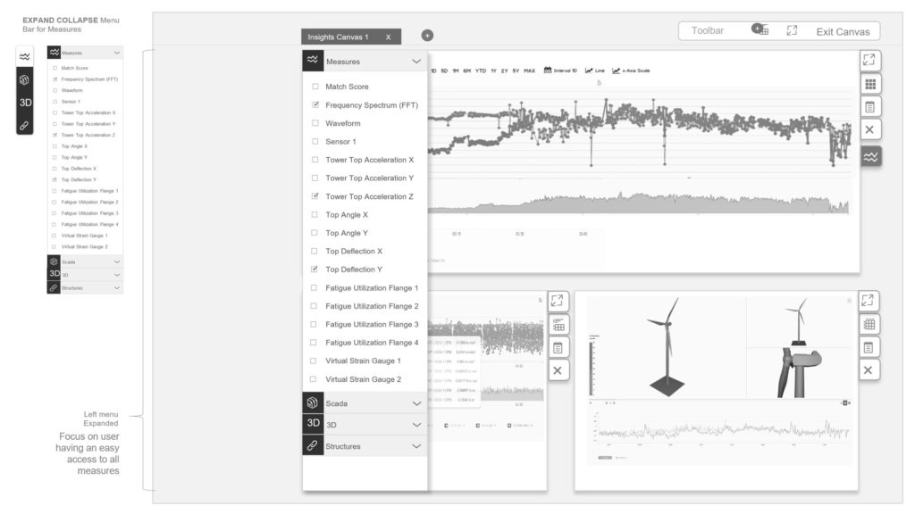
the user needed an ANALYTICS CANVAS tool similar to OneNote where he could do analysis with real time data and compose his investigation and thoughts.
Was i on the right track or in love with my own idea ? we designers do have a tendency to do that !
CREATING THE AD HOC ANALYTICS CANVAS
I quickly sketched out some wireframes and created an ad hoc analysis tool in low fidelity . Further customer calls gave an insight about adding tabs so that the service engineer could analyse rotors in one tab and maybe motors in another !User could select an asset and compose multiple canvases (as tabs) .
He could layout time series and also 3d structural charts side by side and investigate deeply from different slices in time or across different sensors of the same assets to come to conclusions. The canvas had layout options enabled my a mode.
Envisioning the canvas as a modular element which could also be embedded as a section in different applications was also one of the explorations.
This project is evolving in a big manner and moving in multiple directions in the product suite which includes simulations etc.